No edit summary |
Tag: Visual edit |
||
| Line 64: | Line 64: | ||
Along with the graphical design, characters were somewhat different too. |
Along with the graphical design, characters were somewhat different too. |
||
| − | [[Mario]] did not look much different than his final counterpart. |
+ | [[Mario]] did not look much different than his final counterpart, but his hair and cap used to be more pointy in the beta. |
<gallery> |
<gallery> |
||
Revision as of 21:00, 12 October 2018
This page is for listing things present in the beta or early versions of Super Mario 64.
High Pitched Mario
Before Charles Martinet was going to voice Mario, Mario's original voice was much different. His voice sounded much higher pitched, almost un-human, but the voice did sound somewhat more playful. You can listen to it below:
Paper Mario Meter
During the earlier stages of the beta, instead of Mario's more modern head, a head that looks strikingly similar to Paper Mario's head was used as the life meter (This may of inspired the first Paper Mario, as the beta was many years before Paper Mario came out).
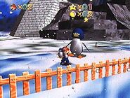
Two Chill Bullies
Originally, there were two Chill Bullies, one large and one small. The small one was eventually removed.
Different Health Meter
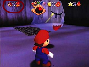
The first design of Mario's Health Meter had a clock like mechanic rather than pie pieces, and an arrow pointing to his health. The number of his health also was there instead (i.e. 5,6,2 etc).
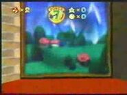
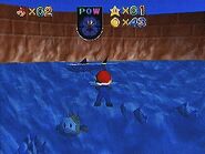
The second design looked a bit more similar to the final. However, it lost health clockwise (instead of counter-clockwise like the first and final meter). It also had a "POW" which stood for POWER.
The third meter looks identical to the one used in the final game.
The fourth and one seen in the final game was likely implemented in the twilight stages of the beta or near the last second.
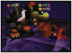
Different Level Design
Throughout the beta, the settings of the game were very, very different compared to the final version.
Peach's Castle had very few windows unlike the final version, and Peach's portrait on the front wasn't present.
The interior though (at least the lobby) was much different. The walls were painted dark with moons and stars, the stairs in the middle were platforms instead of stairs, and many of the rooms looked different.
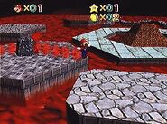
Cool, Cool Mountain and Lethal Lava Land also had different layouts and graphics, but other than that, they are easily recognizable to their final counterparts.
Different Character Designs
Along with the graphical design, characters were somewhat different too.
Mario did not look much different than his final counterpart, but his hair and cap used to be more pointy in the beta.
Boos also did not look too much different either.
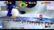
Mother Penguin had a somewhat different design, as she had a slightly different body and head.
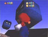
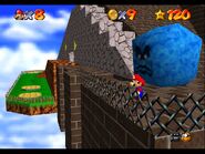
Thwomp's may of had the largest difference. They were a darker shade of blue in color, and had more menacing/daring faces.
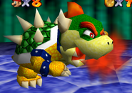
Bowser had practically no differences (like Mario) at all.


